From carbon nanomaterials to manufacturing investigations, I enjoy understanding what the data is trying to tell us—and testing whether the explanation holds.
I am drawn to the details that a summary can hide. Baseball offers an analogy I like: from batting average and runs batted in, to on-base and slugging percentages, to Statcast measures such as exit velocity and launch angle. Each perspective invites a different question about what drives the result.
I bring that curiosity to engineering: look beneath the headline number, find a meaningful pattern, and use process knowledge and experiments to test the explanation.
01 · Carbon nanomaterials
Small interfaces. Different behavior.
2011 · First author Applied Physics Letters · 99, 033111
Capacitive carbon nanotube networks in polymer composites
What happens where a nanotube meets the surrounding polymer?
This study examined electrical transport across nanotube junctions in a polymer composite. The junctions behaved like small tube–polymer–tube capacitors. Electron paramagnetic resonance supported localized spins at the interfaces, and the paper proposed a transport mechanism tied to temperature-dependent free space within the polymer. Looking closely at the interfaces helped explain why the surrounding material matters alongside the nanotubes themselves.
Can graphene form directly on a substrate, without a separate transfer step?
This application describes a laser passing through a transparent substrate to heat a metal layer beneath a carbon-source coating. Graphene forms at the substrate–metal interface; the remaining carbon source and metal are then removed. The approach targets a simpler route to graphene layers for transparent electrodes. It reflects an interest that continues in my work: redesigning the process to remove an additional handling step.
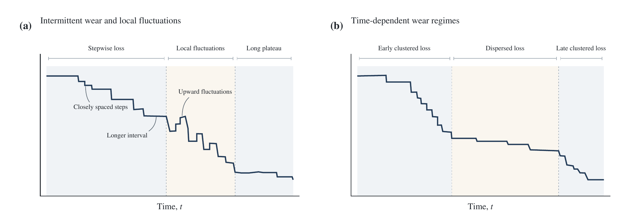
Process improvement sometimes begins with a curve that is easy to overlook. During troubleshooting for a process upset, I noticed that a routine wear trace looked different. Some loss events clustered closely together; others were separated by longer intervals and plateaus. The recorded curve also showed local rises and fluctuations. That small observation became a reason to examine the process more closely.
I translated those differences into comparable features: overall and segment slopes, event spacing, plateau duration, and local fluctuations. I considered sampling frequency and measurement resolution, and used R² to assess how well a fitted model described the data. Comparing these features across batches and process inputs gave us a clearer basis for tracking and testing the patterns I had noticed.
The analysis informed input-parameter controls and adjustments to operating settings, helping the team improve process stability. What began as a small clue during troubleshooting became useful evidence for ongoing improvement. This is the kind of analysis I enjoy: looking closely enough at everyday data to find a question worth pursuing.
Schematic reconstruction from hand-drawn traces. Shaded regions mark qualitative time windows; the figure does not present calibrated production measurements.
03 · Investigating a roughness issue
Finding a pattern in an unfamiliar defect.
During a glass-production ramp-up, an unfamiliar roughness issue disrupted the process. With limited usable measurements, I led a technical investigation to build a clearer picture from incomplete evidence, then test which process changes could influence the issue.
See beyond individual samples
I combined individual glass maps into a three-dimensional composite. This made the spatial pattern easier to examine and compare with possible flow behavior. It also helped us separate the observed pattern from our initial assumptions.
Make the pattern measurable
We defined the defect’s frequency and intensity, then examined their relationships with process conditions. Correlations helped us organize a fault tree and decide which hypotheses to investigate; they were a starting point for verification, rather than proof of a cause.
Test what the process can change
I worked with colleagues across sites and functions to plan and run a series of designed experiments. We considered operating risks and upstream, downstream, and quality constraints. The trials changed the defect pattern, giving us evidence of its sensitivity to process conditions.
Conceptual illustration of the analysis approach. The correlation panel illustrates defect height versus a process parameter. The profiles and data points are synthetic; the displayed r and R² are illustrative values, not measurements or results from the original investigation.
What the investigation clarified
The trials produced partial improvement, but full recovery was not achieved. The work helped distinguish what process adjustments could improve from the limits imposed by the equipment’s condition. That understanding gave the team a stronger basis for deciding whether further intervention was worthwhile.
See how I turn technical understanding into coordinated action in Projects →.